Wednesday, December 18, 2013

Blog Exercise: Visual Techniques


Visual Techniques List 1:
Tone Contrast, flow, composition contrast,
hierarchy, sharpness, movement, transparency, bold 
Visual Techniques List 2:
Flow, hierarchy, repetition, irregularity, subtle, variation, functional  

Compare and contrast: The top photo of a poster is created more organically and its visual hierarchy creates a flow that brings us around the poster, viewing each aspect. Asymmetrical design, with bold colors and figures make it eye catching. Using a more structured style, the second photo is functional and the flow is created through repetition. The varying block sizes create a hierarchy that flows through the spread. Both examples, although formed differently, have a subtle sophistication with a punch of design. Simple enough to get the message across, but also visually interesting to get the viewers attention.  


Wednesday, December 11, 2013

Blog Exercise: Contrast


Here the contrast is working well with each of the elements. The model is able to be the star of the cover while the type around him is still legible. The pops of color contrast the neutral colors and draw the eye in. Adding to that is the contrast in type size, which creates a hierarchy of what to read. Eventually leading the viewers eyes around the entire cover.  


This is an example of poor contrast. It is over saturated with colors, photos and type. There is no room to breathe in this cover, so the viewer is unsure of where to start. Most of the type is the same size in competing loud colors with no contrast to demand hierarchy. Then the collage of people's heads each require attention, building onto the confusion. The color blocks of separation do not aid in creating contrast for the viewer. 

Wednesday, December 4, 2013

Blog Assignment: Design Success and Failure / Syntactical Guidelines

 Success
Fail


These two posters have various similar qualities, however the one that succeeds is able to communicate its message more clearly. In the success poster the typography is balanced and the negative space around the figure brings attention to the center, then draws the eye to the title with the pop of color. In the failed poster, it is difficult to determine the typography hierarchy. There is so much type in varying sizes that it consumes the necessary negative space it needs to breathe. The grouping of figures is also distracting and presents itself as one jumbled blob instead of a visual story. 

Wednesday, November 13, 2013

Blog Exercise: Movement/Motion

Option 1


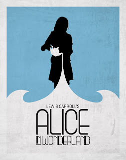
Implied motion is mostly prevalent in the curves. The negative space and contrasting colors draw the viewers eyes to the girl's silhouette, then to the teapot. Turning our attention to the teapot's curves directs the eye downwards and into the waves that wrap around. Viewing the teapot tipped over we have an expectation of liquid falling from the teapot adding to the suggestion of movement.


These posters are examples of implied movement. The repetition of shapes in a diagonal manner gives a sense of direction. There are also the crossing of patterns, producing static and energy. Followed by the diminishing size of shapes to further the claim of movement. Negative space acts as a backdrop to the motion of the objects.

Wednesday, October 30, 2013

Blog Exercise: Tone and Color


How Tone is Operating:
Cool tones are apparent throughout this ad. The soft sky and crisp blue ocean compliment the natural tones of the rocks, wood and sand. Contrasting the cool tones are the bold and warm tones from the Corona bottle. 

How Tone is Interacting: 
The tone of the ocean with its light and dark, create a movement. Specifically where the brightest of the whites meets the ground, and where the darkest tone creates folds in the sand. Also, the varying tones of the beer make it appear crisp and refreshing.  

How Color is Operating:
Colors in this ad act as focusing points. The textures of the wooden arm rest draw us in, and its line leads us to the bright and bold Corona bottle, creating a focal point. Presenting itself in front of subdued colors to standout. 

How Color is Interacting:
The colors are interacting with each other giving off a sense of relaxation. There is no static to distract us, and the soft colors put us in calm mind set. With the softness is the punch of color from the bottle, reminding us what the ad is for. 

Wednesday, October 23, 2013

Blog Exercise: The Basic Elements

Shape: Shape is utilized here to draw and divide attention. The squares around the date are straight forward and get to the point. While the silhouettes forming triangles in the background are loose and organic, suggesting freedom and action. Squares are used once more at the bottom of the poster, again to provide information with the use of a working shape.  

Dot: The dot, blatantly used here, is a connecting shape. The number of dots, and its liquid nature has us unconsciously blending the form to create a picture in our mind. Composition of the dots also creates an deception of tone in the photo, which helps us create a photo. In this case, a portrait of a woman's face. Distance in relation to each dot can make the eye view an image more or less intensely. 

Line: Line is used commonly in photography, especially landscape photography. The directional nature of the line helps us create distance and breaks within a composition. In this photo, the lines of the bridge narrowing towards the center give the appearance of length and draw our eyes to the center. The direct horizon line in the center of the page breaks the photo and gives an endpoint. While the loose indecisive lines of the mountains are fluid and free.  

Wednesday, October 16, 2013

Visual Thinking Research

 
Left: With this one, my friend guessed 18 triangles. She self-organized and started from the cat's tail and ascended the triangles as she counted. To stay organized she grouped the triangles and would outline each one to refrain from the noise of the others.

Right: My guess was 16 triangles. I began from the top with the ears and followed the hierarchy of the triangles. After counting the large triangles in the body, I moved on to the small ones inside the body and then to the tail.


Left: My friend used the theory of similarity and continuity to solve this puzzle. She started from the outside and multiplied her triangles by squares each time she saw a grouping.

Right: When solving this puzzle I used the simple route of counting by familiarity. I saw four squares and counted the amount of triangles in each square. I then worked outwards and counted the larger triangles surrounding the smaller ones.